
Mon kokolela
'Mon Kokolela' is a personnalised agenda solution, eco and co-conceived with and for the users.
Context
The 'Mon Kokolela' project primarily aims to offer a planner that adapts to its user, rather than the other way around. In a second time, the goal is to reduce waste. The primary target audience is secondary school teachers. This solution is exclusively available online; the experience on this site does not represent the personalization of the final product. Furthermore, the client wanted to expand her target audience.
Our intention? To enable 'Mon Kokolela' users to have an experience tailored to their needs, extending beyond the completion of the order.
Project identity :
Project name : Mon Kokolela
UX Methodology : All steps
Project type : End of year project
with a real client
Group size : 2
Solution type : Mobile first website
Duration : 2,5 month
Project Timeline : June - September 2023
Project timeline

This is a diagram outlining the key stages of the project, their sequence, and their constituent elements.
Here is the diagram presenting the project breakdown by week :
Each week, we listed the task by a priority order, which we then distributed among us.
User research
Disclaimer
We would like to acknowledge that some of the questions in our research were constructed with inherent biases, and we made sincere attempts to reach a diverse range of participants. However, it's important to note that a significant portion of our respondents happened to be individuals within our immediate network.
Objectives :
The aim of this study was to understand users' agenda usage, preferences (paper vs. digital), using an inductive approach in our initial discovery to better grasp our target audience.
Hypotheses
Although we used the inductive research method, we had initial hypotheses:
People primarily use digital -> Hypothesis confirmed
People mainly use digital, occasionally combining it with paper support.
Paper users are predominantly creative -> Hypothesis confirmed
Insights
We gained profound insights into the behaviors and preferences of our potential users. Our studies revealed that :
-
users predominantly use digital tools,
-
those who opt for paper agendas often identify as creative individuals and prioritize ecological considerations.
-
designers tend to structure their tasks on a daily and weekly basis
-
our expert audits underscored the need for a more user-centric approach in the website design.
These findings have not only validated our initial hypotheses but also laid the foundation for futur design decisions and optimizations in our quest to create user-focused solutions. We used these informations to build a persona and the map of their experience.


Wireframes
Flows and scenarios
The design phase began with the drafting of user stories based on the pain points and opportunities outlined in the experience map. Following a prioritization process, 3 scenarios and flows were defined to best align with and cater to the users' needs.
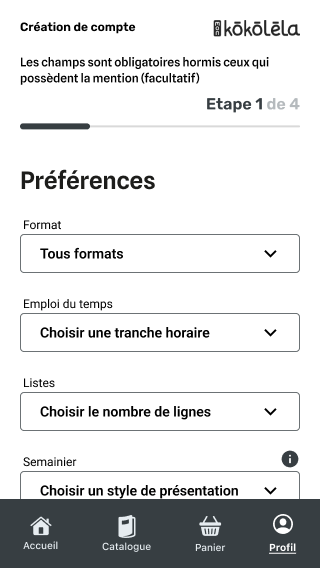
Here are some wireframes screens :


To achieve these diverse wireframes, we crafted a Component Kit to ensure a consistent and visually appealing interface across the various screens and scenarios.
This approach adds user confidence in the interface, offering familiarity and predictability, therefore, enhancing the overall usability and navigation experience.

User testing and iteration
To test the scenarios we used Maze, a platform that facilitates testing and centralizes all data, streamlining the entire testing process.


To see the test results more in depth you can click here
Components and Style
The Kit we crafted for the wireframes was based on components we needed for the scenarios. We then created a list before building what we needed.
Gray-Ultra-Light
Gray-Light
Gray-Medium
Gray-Dark
Colors
Home
Catalogue
Cart
Profile
Nav - bar
This redesign was carried out with a strong emphasis on accessibility, ensuring that the site is user-friendly and inclusive. We also employed a color contrast matrix to guarantee that text and elements meet the highest standards for accessibility, thereby enhancing the experience for all users.


Based on the feedback gathered from the testing phase, we wanted the wireframes to be refined and adapted to better align with user preferences and expectations. Simultaneously, these wireframes were upgraded to high-fidelity versions, enhancing the visual appeal and ensuring a more realistic representation of the final product.

Before

After
Experience feedback
Despite the challenges encountered throughout the "Mon Kokolela" project, I tackled it with determination and commitment, gaining valuable experience in project management. This experience also allowed me to strengthen my skills in user-centered design methods. These circumstances enhanced my ability to undertake initiatives with resilience in the face of professional obstacles,and that will now be part of the skills that I will leverage in my professional practice and that will continue to guide me in my future projects.
You want to know more ?